Page History
Buttons
The color of the buttons is the same as "Color Link".
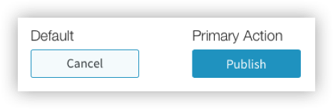
| Button Customizations | Type / Option | Example Value | |
|---|---|---|---|
| Default Buttons: | |||
| Background | X | Color | #F4FAFC |
| Gradient | |||
| Border | None | ||
| X | Stroke, Color | 1px solid, #3192BF | |
| Text Color | Color | #3F4548 | |
| Primary Action Buttons: | |||
| Background | Color | #3192BF | |
| Gradient | |||
| Border | X | None | - |
| Stroke, Color | |||
| Text Color | Color | #3F4548 | |
Pagination
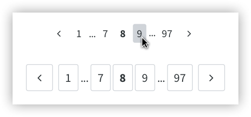
| Pagination Customization | Type | Example Value |
|---|---|---|
Background on hover (only on desktop) / Border (only on mobile) | Color | #D0D4D9 |
Input Fields
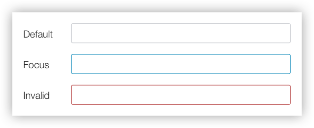
Default
Highlight Color
Used for progress bars, some icons and some text highlighting.
| Highlight |
|---|
Rating

Rating Stars
Selected Star (solid color)
#888C8F
Deselected Star (outline only)
#888C8F
| Customization | Type | Example Value |
|---|
| Color |
| Color |
| #D0D4D9 |