Page History
Modern web pages are created with responsive web design in mind, allowing a maximum range of users with a wide variety of devices to be reached. As a result, video content must be delivered in a player that meets responsive design requirements. movingimage provides this possibility and allows customization via the Player Generator.
In the Player Generator, you can set breakpoints - these are predefined points (widths of the player in pixels) that define when the layout of the web page should change depending on the size of the device (tablets, smartphones, etc.).
In addition, you can show or hide individual controls when the Player width is smaller than, larger than, or within the range of the breakpoints. This prevents the browser of a mobile device from shrinking the content to the point that it becomes unreadable.
| Note |
|---|
Configurations for responsive players apply only to HTML5 players. |
To configure a responsive player, follow these steps:
First, make sure you have configured the global settings for the visibility of the controls (see the "Controls" chapter).
Info By default, non-globally visible controls are not available in responsive players.
Page break - By clicking the appropriate tab, enable the option "Responsive Player".
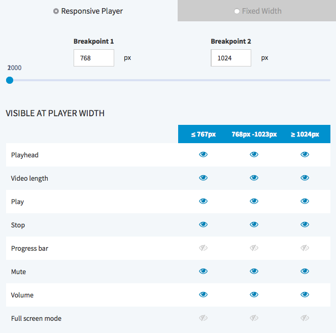
- Define the breakpoints by using the slider control. Alternatively, you directly enter the desired values in the fields provided.
- Now you can view or hide the controls available for the respective player width, by clicking the [
 ] icon of the item.
 Click the [ Apply ] button beneath the preview player to apply your changes.
Warning Applying your changes to the player settings affects all published videos that use the same player.